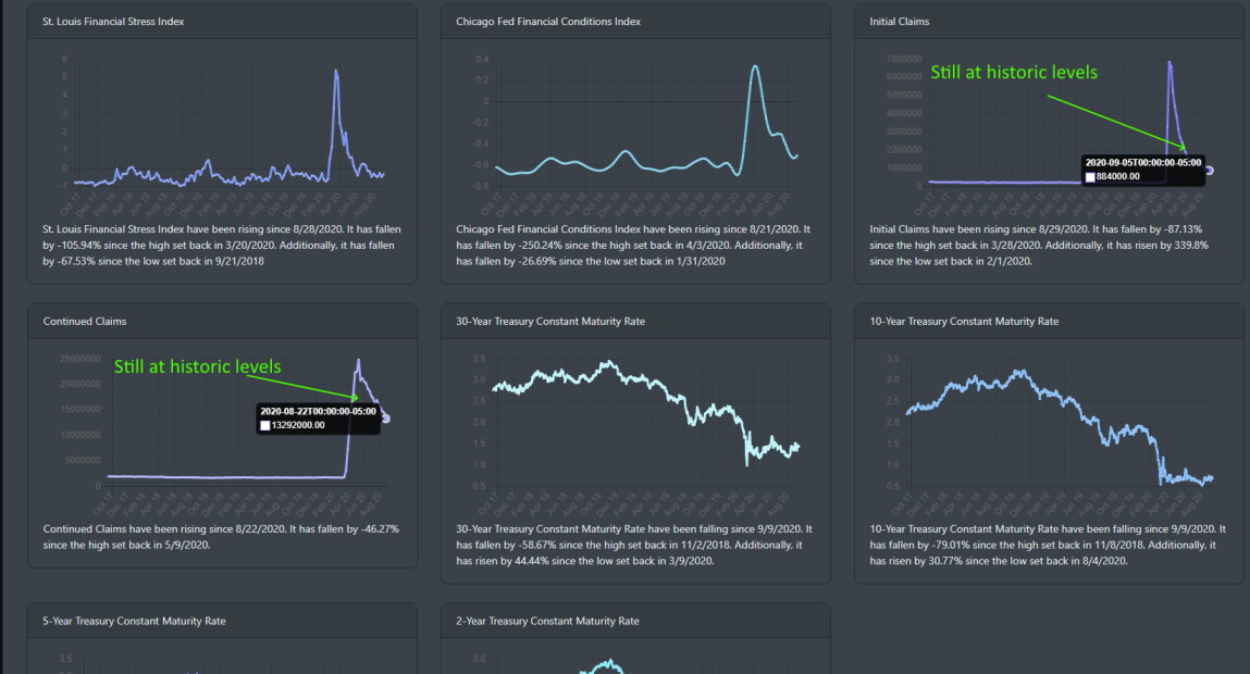
is what the market looks like it is doing. In some of our previous blogs, we looked at the economic data with MogulUp's fundamental data analysis. Though there are areas where the economic data shows a V-shape improvement (pre-COVID 19 levels), the initial unemployment claims data that came out on September 5 paints a serious path to economic recovery. Taking a look at the data (seasonally adjusted initial claims and continued claims), we see that the levels are historically high. 884, 000 for initial claims and 13,385,000. Both these indicators have risen from last week as well. Clearly, the labor market has a long way to go in the recovery process.
Current Market Correction
As discussed in our last few blogs, the markets were being pushed too high extremes. For investors, the Fear of Missing Out (FOMO) kicked into high gear and propelled the market trading to 3-standard deviations above the long-term moving average. Even with the current correction that is occurring now, the market on a weekly timeline is still highly overbought and over-extended.
In the short-term analysis, the market is holding steady. Both the S&P 500 and Nasdaq 100 peaked on 9/2/2020. Since the S&P 500 has fallen more than 6 percent and the Nasdaq 100 has dropped 10 percent. From a technical perspective, the current decline is a perfect example of a textbook correction.
S&P 500 Support Level
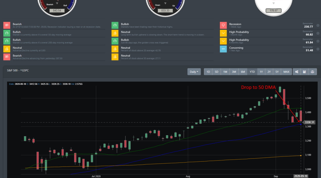
The image below is from BullGap's Big Picture analysis. It is evident that conditions have changed suddenly in a span of less than 10 trading days. The S&P 500 declined sharply from Thursday 9/3/2020 to Tuesday 9/8/2020. The decline found support right on the 50 DMA. It has now been consolidating on this key technical support line.
QQQ Support level
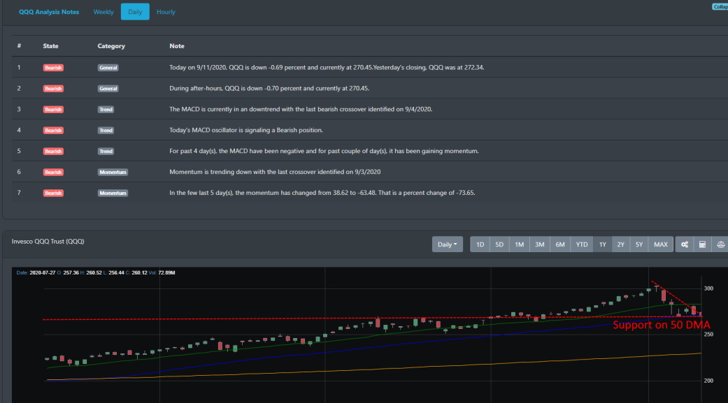
A similar scenario can be found on the Nasdaq Index. Here we are looking at the ETF QQQ and we can clearly see that the daily technical signals are reading bearish. And if we view QQQ's chart, we can see after falling on the same days as the S&P 500, QQQ landed firmly on its 50 DMA. It has since held this key support level on multiple retests since.
Stock Price disconnect
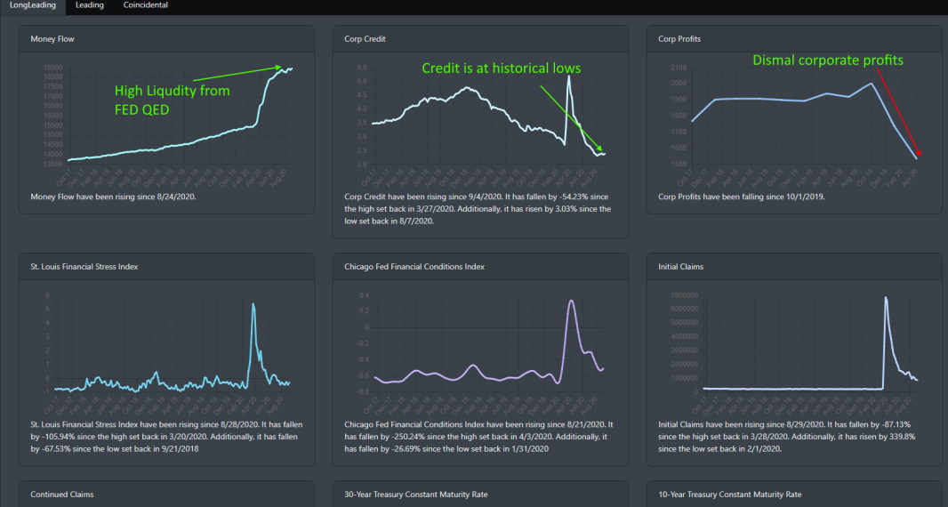
We have written several blogs where we have commented on the extraordinary disconnect between stock prices and corporate earnings\profits. Using the S&P 500 as the measuring stick for stock prices, there has historically been a strong correlation between stock price movement and corporate earnings. Since COVID-19, there has been a sharp divergence between stock prices and the underlying earnings of those stocks in the S&P 500.
Elevated Volatility
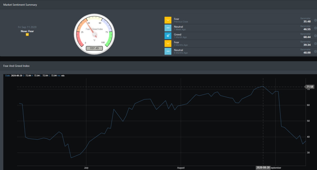
Since hitting Greed in August, the market has quickly changed gears and BullGap's Market sentiment indicator is showing that investors are very much on edge.
Test coming
This support level is encouraging for the bulls as it can be viewed as a healthy correction that will allow the market to find its footing and resume its move to the upside. In the next few days ahead, it will be critical to see if the market can move up above its short-term 20 day moving average (DMA). You can see this green line in the S&P 500 and QQQ chart above. The market has been trying for the last few trading days to push above this. There is a short-term oversold condition in the technical readings which may result in another attempt by the bulls to re-test the 20 DMA. However, there is also a large downside risk to the 200 DMA. This would be a 14% decline from the peak from the beginning of September. For now, the market is consolidating along with the 50 DMA. This looks like a textbook correction and not a major collapse in the financial market.
